
ROLE Sr. UX Designer
CONTRIBUTION Shortly after joining the Amazon MP3 team I was asked to create an identity for a music management product. The concept of the product was new to consumers and the music industry. The challenge was to build an identity that presented the value of the product but still provided the benefits of our existing service. The creative process began by learning about the existing customer experience and acknowledging that cloud computing would not be a familiar term for our customers. Many concepts followed and the chosen concepts were presented to the CEO, SVP, and VP. The logo was well received at launch and used in several PR placements.
ROLE Sr. UX Designer
CONTRIBUTION Amazon was expanding its digital entertainment offerings and decided to create a gift card that focused on digital music, video, books, and apps. In order to tie the group together, an umbrella brand was needed. Amazon Digital was created and adopted the typeface made popular by Kindle in reponse to recent corporate branding adjustments. The gift card has been very successful, out performing other well established Amazon gift cards.
ROLE Art Director and Senior Designer
CONTRIBUTION Design objectives were to resolve technical issues with the current logo (reproduction, scaling, form consistency) as well as support the refreshed corporate message. The creative process began with deconstructing the logo and learning about the previous designer's decisions. Many sketches followed with internal creative reviews. Vector layouts of the chosen concepts were presented to executives and board members, then cycled through revisions until a unanimous decision was made. The new logo has been well received by both staff and customers, representing a service that caters to content (publishing) and data (government) markets.
ROLE Art Director and Senior Designer
CONTRIBUTION The recession hit and the Oya Group's brand was in need of a refresh in order to remain competitive. A great deal of time was spent on competitive analysis, internal staff interviews, and identity design research. Clients were brought into the testing stage as the internal team had narrowed down their choices. The final logo was chosen because it represented a timeless design, using the Goudy typeface with adjustments to the shapes and size of each character. The color red was used to represent our passion for design, to stand out against competitors, and speak to the story of the goddess Oya.
ROLE Associate Art Director
CONTRIBUTION Prograf was being introduced to the European pharmaceutical marketing and needed a logo design to extend the Astellas brand. In order to maintain a link to the parent brand, I decided to experiment with reversing the core element's shape (a graft of two items). The square complimented the shape of the typeface, the curved shapes maintained the link and unique contrast, and the red represented the global parent Astellas brand.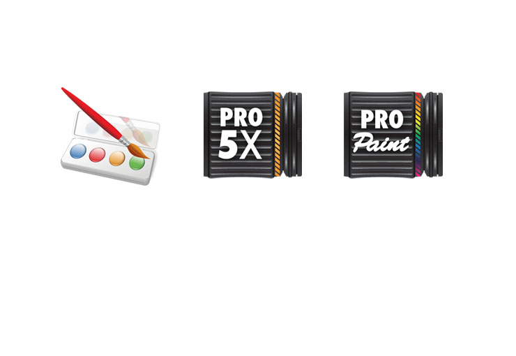
ROLE Identity Designer
CONTRIBUTION Popcrowd Software was a pioneer on the Android marketplace and was growing rapidly. At the same time, Android was supplying early stage style guides for user interface designers. Pic Paint was Popcrowd's first app and the logo reflects the two point perspective style of the early Android market. Many designers did not follow the style guide and so the guidelines changed, which is reflected in the PRO Zoom Camera 5x and PRO Paint Camera logos. The logos have been successful in quickly communicating what the apps do while maintaining their readability on a small mobile screen.
ROLE Identity Designer
CONTRIBUTION With the success of Popcrowd Software's three Android apps, the time had come to establish itself as a corporation. A visual presence was needed to speak to the community of users who are known as the 'popular crowd'. Without being to literal, the logo needed to be friendly, universal, and have a good screen presence. The simple typeface uses a bright yellow that can hold its visibility on various screens, and the bubbles represent the groups of users coming together in the air/cloud.
ROLE Art Director and Senior Designer
CONTRIBUTION VC Taskforce was preparing for their first awards ceremony, honoring local venture capitalists for their contributions to the industry. The identity needed to be classic and fit onto an etched glass award as well as on printed and electronic material. The final design used classic typography and symbols of glory to represent the accomplishments of the awarded individual.
ROLE Art Director and Senior Designer
CONTRIBUTION MedSpan realized that along with the website design we were doing for them, they needed a new logo. Their previous logo used a very literal representation of a bridge to signify the 'span' of research they cover in the medical industry. They did not want to depart from the symbol, so I prepared a design that maintained the 'span' but this time actually arched over the 'Span' so it could become more simplified. A horizontal version was also supplied.
ROLE Identity Designer
CONTRIBUTION Harmony is was just launching in the mid 90's and needed a visual identity. The service the company provided was muscial therapy and education for children. The logo element was crafted to relate directly to the business as well as signify education through an embrace. To this day, the founder of the company is extremely please and says her clients easily identify with it.