
ROLE Sr. UX Designer
CONTRIBUTION In 2011, Amazon released Cloud Player. Working with the Senior Site Merchandiser for Amazon MP3, I created a branding campaign to support customer awareness, education, and press coverage for the launch. The media — including Rolling Stone, CNET, Wired, and TechCrunch — was quick to copy the campaigns into their material. Meanwhile, customers were greeted with information to help guide them through their purchase path decision making. Feedback and reviews were very positive and the brand has been expanded to include more devices, payment plan offerings, and added value messaging.
ROLE Sr. UX Designer
CONTRIBUTION Amazon Cloud Player was a success and efforts to introduce MP3 store offerings grew to raise awareness for new customers. Campaigns included notifying customers about Cloud Player accessibility on the existing Amazon MP3 Android app, special deals like Lady Gaga's $0.99 Born This Way album, and store credit specials. Each campaign has been very successful and responsive to customer feedback.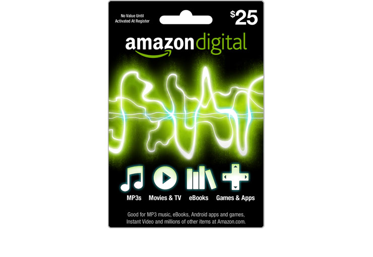
ROLE Sr. UX Designer
CONTRIBUTION In 2011, Amazon launched Cloud Player, Appstore, Prime Instant Videos, and Kindle Fire. In response to the expanded digital offerings, a gift card was created to endorse the stores and make it easy for customers to gift the content. Working with the gift card team, I prepared a series of concepts and narrowed them down to two. These were cycled in reviews until the team was prepared to present them to the SVP, VP, and store Directors. The chosen design and custom art was prepared for production and handed off to the gift card team. The gift card has been very successful and has out performed other established Amazon gift cards.
ROLE Art Director and Senior Designer
CONTRIBUTION Cisco was launching its refreshed brand and The Oya Group was given special early access to use it. The I&D group needed a full communication campaign based on the new look, but with its own unique message and visual approach. After I presented a range of concepts, a design was chosen and applied to a series of ads, lobby banners, email banners, and tradeshow booths. Turn around time was rapid, style guidelines were prepared and distributed to the design team, and detailed reviews of all campaign parts ensured production quality. My work has been recognized as a "best practice" example of the new brand by Cisco's brand manager.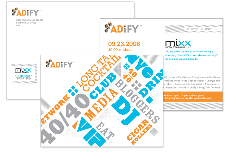
ROLE Art Director and Senior Designer
CONTRIBUTION Adify was hosting an exclusive afterparty for the mixx conference and called upon The Oya Group to design an invitation for it. Previous years had catered to a young clubbing demographic, but this time the invitations were targeted at top bloggers. The event took place at Jay-Z's 40/40 club and the attractions were packed with cigar rollers and ice sculptures. I explored material the bloggers would already appreciate—an issue of Wired magazine featuring top blogger Julia Allison—and tied it into the Adify brand. Two Pantones complimented the logo colors and a metallic ink were used to create the dynamic, chunky type layout.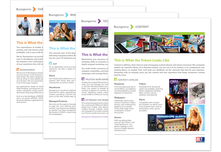
ROLE Art Director and Senior Designer
CONTRIBUTION Buongiorno—an Italian mobile media company—was entering the US market and needed branding help from Oya. They wanted sales material to help communicate their services and show they were a leading partner for mobile operations. To stand apart from the competition without going through an entire brand audit and refresh, I created a family of sales sheets that focused on illustration style rather than strong branded elements. Each graphic banner supported the content and would be able to adopt future brand adjustments. A folder with a simple parent logo was also prepared in order to last through any future brand updates.
ROLE Art Director and Senior Designer
CONTRIBUTION The recession hit and The Oya Group's brand was in need of a refresh in order to remain competitive. A great deal of time was spent on competitive analysis, internal staff interviews, and identity design research. The story of Oya needed to remain strong so I used isobars as a graphic element to support the theme of weather and change (Oya is a Yoruba Goddess of commerce and change). The logo red was used to highlight information and attract attention. An invitation to a company hosted event carried the brand style through as a first direct mailer to our clients.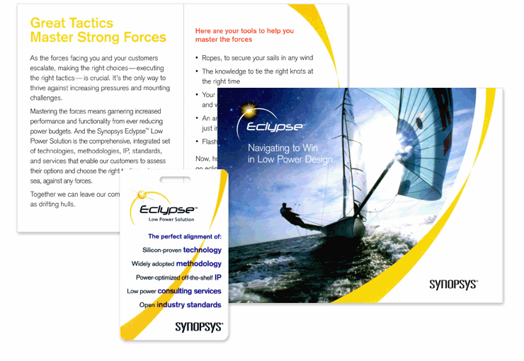
ROLE Art Director and Senior Designer
CONTRIBUTION Synopsys had launched their Eclypse Low Power Solution for chip implementation and wanted to promoted the product at a conference. The logo had already been designed so our writer at Oya took on the theme and messaging. Once the nautical theme was approved, I searched for imagery to support both the message and the logo. I combined a very active sailing ship, which conveniently was eclipsing the sun, with another image of a star lit sky. The graphic element and colors were used through the rest of the material, which was inserted into a pillow box along with a compass, badge, and brochure.
ROLE Art Director and Senior Designer
CONTRIBUTION Cobalt is a biofuels start-up and needed material for their investor presentations. The brochure had to communicate their unique distilling process and why it was worth investing in. The main challenge was the information graphic explaining this process. What was once a complex collage of photographs, line drawings, and text turned into a simple graphic story anyone could understand.
ROLE Associate Art Director
CONTRIBUTION Prograf had launched a 'True Believer' campaign (I assisted with concepts and design) to reinforce the confidence patients had in the product. This was critical at a time when the patent was due to expire. One piece from the campaign that was assigned to me was a direct mailer. I decided to use an interesting die cut to highlight the brand element, so when you pulled on the blue gradient it released a card from the pocket. The success of this was that the fair balance could be hidden on the inside card since the word 'Prograf' wasn't revealed until the card was pulled out.
ROLE Art Director and Senior Designer
CONTRIBUTION Living-e had undergone a full brand refresh for the American market with the help of some talented freelance designers at Oya. Once the core look and feel was established, it was up to me to follow-up with any other projects. One of these was an advertisement for a magazine in England. My experience as a student in Ireland and working on the European accounts at Kane & Finkel had prepared me well for the production. The use of the American version of the brand in the UK was the beginning of the global adoption of the style.
ROLE Art Director and Senior Designer
CONTRIBUTION Intacct was undergoing a logo refresh and needed collateral material to support it. I had just joined The Oya Group and had to start working on it immediately. I crammed some research in about the company and product before diving into sketches and graphic layout exploration. Then, in front of my new boss and the executive staff at Intacct, I presented my concepts. Besides one moment during the meeting when someone detected my subtle Canadian accent, all went smoothly and we left the meeting with a clear choice and direction.
ROLE Associate Art Director
CONTRIBUTION OrthoNeutrogena had decided to up its competitve marketing and create a campaign that directly targeted a competing brand. The managing Art Director and I worked closely to create a concept that would relay the message without showing the competing product. Color and story played a major role in the success of this series of mailers. The cover presented an image of something clearly out-dated and covered in the competitor's color purple with a teaser headline. The interior revealed the punchline and the modern symbol meant to represent the Ertaczo product.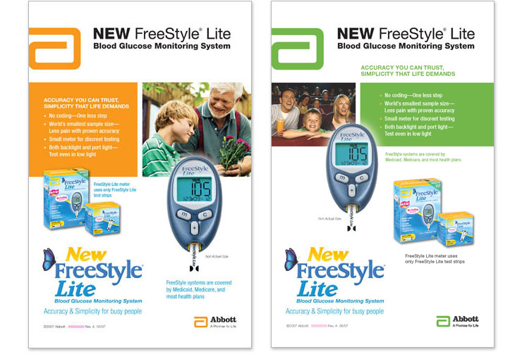
ROLE Associate Art Director
CONTRIBUTION After applying my video production skills to a pitch project that helped win the Abbott FreeStyle account, I was awarded a group of assignments for the brand. One was a series of digest ads. The Abbott style guide was strict so it was a challenge to make each piece stand on its own. Using the Abbott color palette and stock photos that suited their library style, I created layouts that had the same message, grid, and subjects, but unique presentation.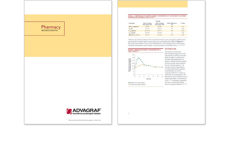
ROLE Associate Art Director
CONTRIBUTION The Art Director managing the European brand of Prograf (Advagraf) had resigned and I was handed the remaining workload. A style had been set but new content and strategy demanded a refreshed look for the research material. The technical brochure was given a strong grid, a consistent color palette, and clean information graphics. The design kept in family with the previous brochures but also stood on its own.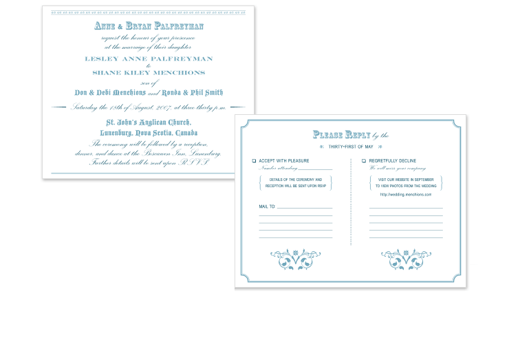
ROLE Designer
CONTRIBUTION The design decisions for my wedding invitation began with its location—Lunenburg, Nova Scotia. The town is famous for Victorian architecture and building woodenships as it sits on the shore of the Atlantic Ocean. The typography was inspired by Victorian era announcements, which were abundant with script and block typefaces as well as ornament. The dark blue ink had a hint of green to suggest the ocean waters and was letterpress printed on Lettra Ecru paper.